what better time than the darkest year of our lord 2020 to celebrate my favorite Poe story, "The Masque of the Red Death"? this crisp tale of an arrogant, cocooned aristocracy reveling while the world burns surely has zero import today.
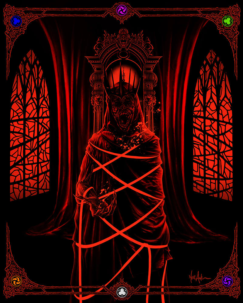
while this has been a deeply, wearying-to-the-bone HALF YEAR thus far, let's skirt the current state of affairs and instead talk about blood-drenched gods of pestilence descending upon the callous and decadent. you know, more hopeful fare. i've loved this story since i was a child*+**, due in large part to the primacy, front and f'ing center, of its garish and evocative color palette. i've spoken on this before, and it's obvious everywhere in my non-narrative work, but i live for what RuPaul might call "Technicolor fantasy." [happy Pride, btw.] it's probably rooted in a bedrock-foundation visit to Disneyland at just the right age, further manifesting in a positive feedback loop with garish old American International and Hammer horror films. i adore the audacity of Prospero's vision of the series of imperial suites in their wild hues, lit by braziers through stained windows. it flickers behind my eyes.
so this one was a challenge that came at the right time. i feel like the prints in this series to date - Beetlejuice, Event Horizon, and The Gate - have been hit or miss in terms of what i visualized and wanted to achieve. The Red Death benefitted from a fundamental change in my COVID-era mindset, in which i'm far more comfortable with trashing hours of work that didn't line up quite right. this one is pretty close to what i see in my head when i read the story.
so let's talk art. i find it legit interesting that the series of colors in the chambers sounds super cool on the page... but the adjacent color combinations actually look awful when presented to human eyes. i really should have seen this coming. i had so many ideas about dramatic layouts for this print that would better incorporate the spectrum of the suites, but... no. god, no. it took a hideously long time just to settle on the minimalist framing kludge, which i think actually worked out reasonably well. i certainly have a newfound understanding for the artistic license that Corman et al. took in swapping out several of the colors in their weird and delightful 1964 Vincent Price adaptation. as written, that dog just don't hunt.
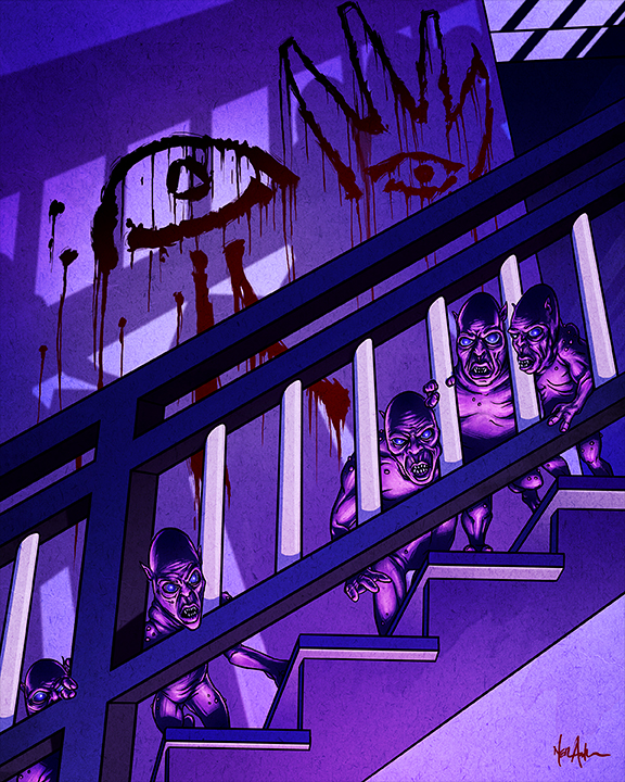
obviously all of the horror cons are cancelled this year, and in part this piece is me mentally preparing for a pandemic-exiled Halloween. [my guts are roiling as i type this.] i'm working out kinks in getting high-quality physical prints of this new series, and repurposing some old artwork from the Rossi collab era, but i guess i've got some time. someday. someday i will have a little booth to peddle fragments of my haunted brain. i will meet beautifully strange kindred spirits and all will be right with the world.
you have to believe in something.
in closing, i should have called this "Illimitable Dominion," but f it. the Red Death doesn't need to impress anyone.
/.n [while listening to old-timey Marilyn Manson, "Antichrist Superstar." it's like comfort food. aaaand, i just realized it turns 25 next year... O.O] [update, 2022: welll, throw this boy on the pile with Michael Jackson. :( :( :(]
*fun aside: when we were small children, my brother and i gorged on every book of horror, fictional and otherwise, we could get our hands on at the library. like, age-way-inappropriate stuff. my grandmother expressed concern to our mom that, "those boys are going to grow up perverted." i mean, she wasn't wrong!
**uh, so apparently i told that story last time! i guess i really miss my grandma. :( she checked out at the right time, 2020 would not be for her.